
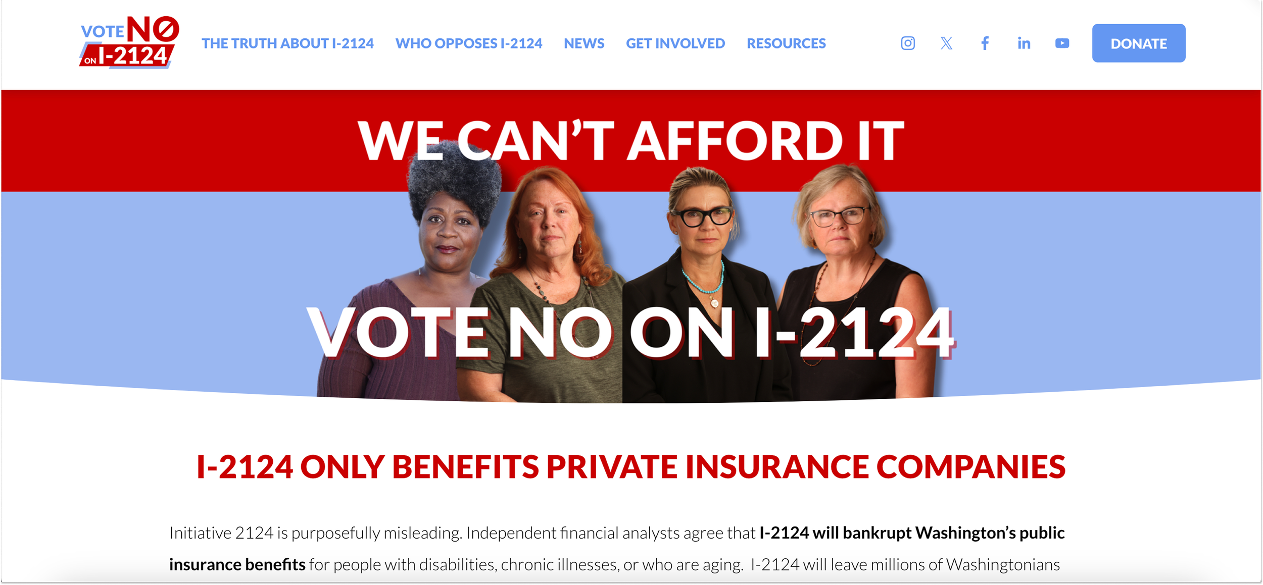
No On I-2124 Website
WA ballot initiative campaign website
Roles: UX Designer, UI Designer, UX Strategist
Challenge
Far-right think tanks and wealthy interests viciously attacked Washington’s long-term care benefits program to help aging people and people with disabilities access care. An onslaught of misleading public narratives seemed poised to convince voters to take critical benefits away from more than 3 million Washingtonians.
With this initiative being introduced on the 2024 WA General Ballot, the opposition and my client needed a central website to prove: key facts, ways for voters to take action in support of the No on 2124 campaign, and stay up to date over the election season.
Results
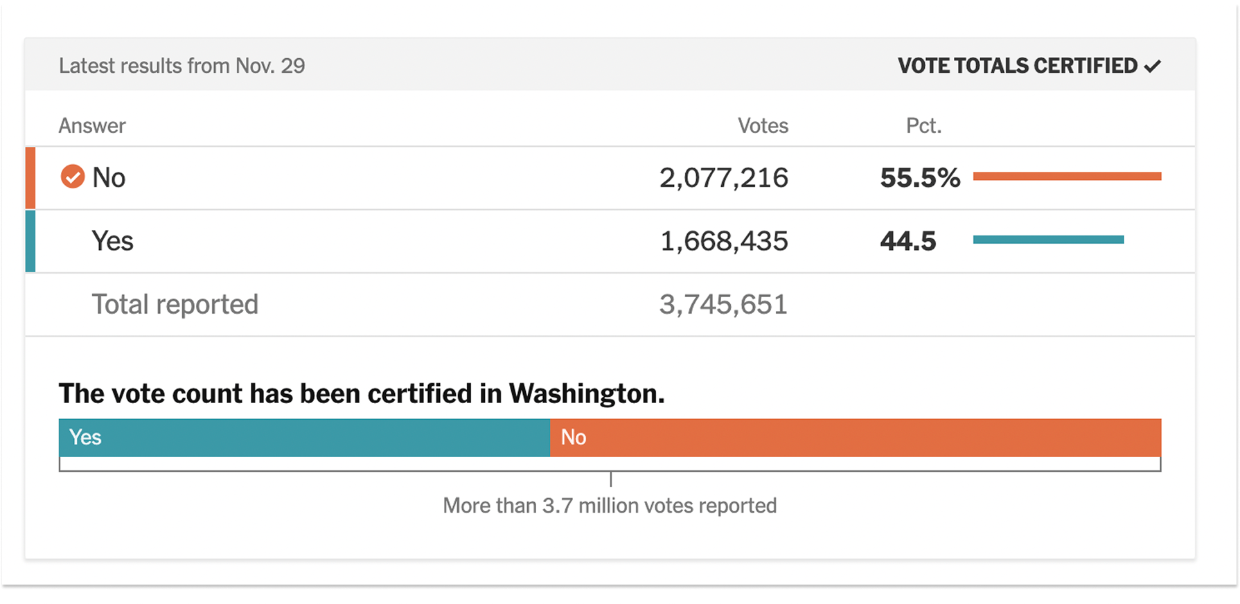
The No campaign won and defeated passing the initiative!
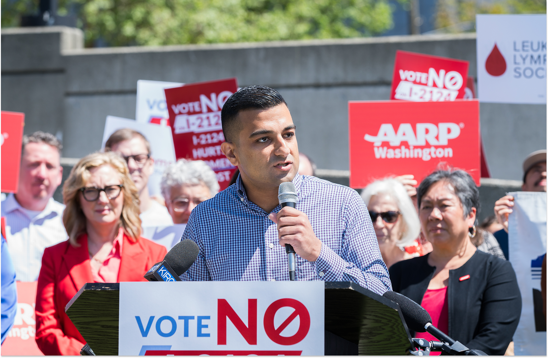
My website was the central hub for all things, news, petitions, volunteer opportunities and information endorsing voting no. Plus, it was the central place all the campaign ads were being redirected.
With this project, once the site was live, that was only the beginning. There were nearly daily things that needed to be change, updated, or removed depending on how things were polling or what the needs of the voters were at the moment.
How I Did It
The short answer is with constant, vigilant updates.
But, also, I set up a design system since this was a longer, on going project. And I constantly, to the best of my ability, kept my client informed about the site map and how the information architecture needed to be structured to keep the user able to effectively navigate the pages and site. By the end of the project, the site definitely was nearing the bloated stage of things. There were constant asks from the client to make more form or petitions or sign ups (they were getting nervous after all), and I was able to make most of those requests a reality, and when I couldn’t I explained in detail why it couldn’t happen the way they wanted it to.
At the end of the election, the website had 21 pages for the user to learn all they could ever dream of learning about the initiative and why it was bad for Washingtonians. Of course, all this to say it was a big, on going project, but most importantly: it worked.

