
Data Visualization Tool
Contract tool embedded on unionizing website
Roles: UX Designer, UX Researcher, UX Strategist, Data Structuralist
Challenge
The client, Essential Works for Democracy, is a grassroots movement to reform and revitalize the labor movement for essential workers. They organize across the U.S. and Canada with rank and file members of unions representing grocery workers, meatpackers, retail workers, and more.
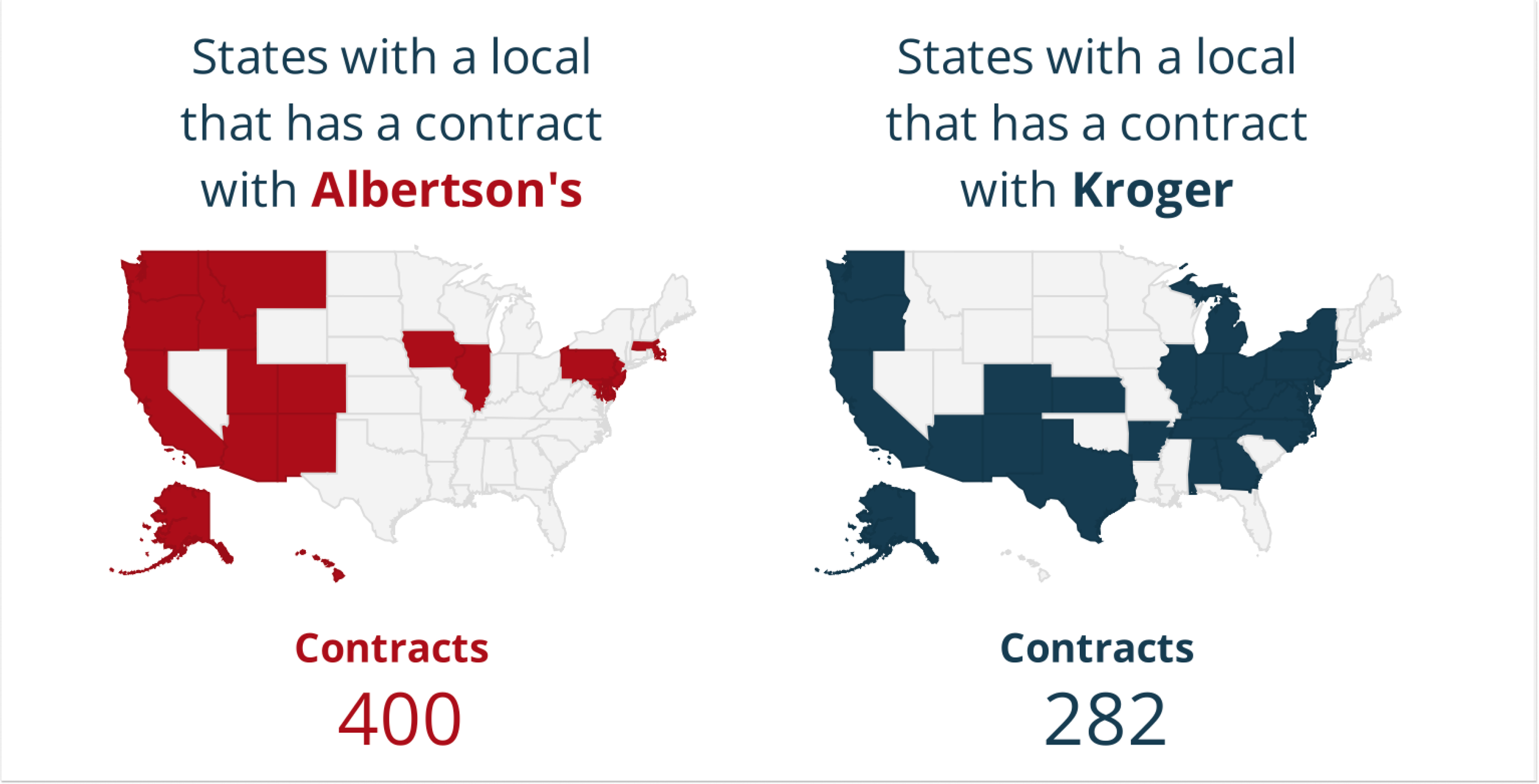
In their efforts to increase the amount of unions and strengthen the power that those unions have, they enlisted me to make them a tool that lives on their website that helps workers and organizers see what contracts currently exist, what stores and union locals are governed by which contracts, and most importantly when contracts going to be expiring.
I was tasked with take a large set of fairly complex data and make it easy to navigate, aesthetically pleasing, and able to live on their already existing website.

Results
A useable, functional tool was made!
My tool now lives on their website, helping union members, organizers, and union-curious workers fight for better protections with power. In the next section I will walk through a bit of the process.

How I Did It
The biggest barrier in this project was the state of the data. Before this project, union locals didn’t really talk with each other or try to negotiate as one. So, actually compiling the data was a project in itself. Even after the data was compiled, reporting across locals wasn’t consistent (some didn’t even have contract expiration dates just general “in 3 years”). What this meant for me was I needed to clean up and standardize the data.
Slowly, but surely I was able to get the data to a workable place (even though there is still significant missing pieces). Then the next piece was how to structure the tool so that users were able to find and search the data for the information they wanted/were curious about. Through user research, I was able to grasp the key ways the users would be using the tool and then built out from there.
By the end of the project, I had a functioning tool to help union efforts grow in strength that utilized 4 specific requested filters, all while still asking for more data. It is not a perfect tool with perfect data, but the real world isn’t perfect.

